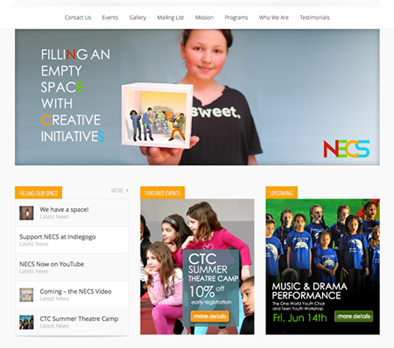
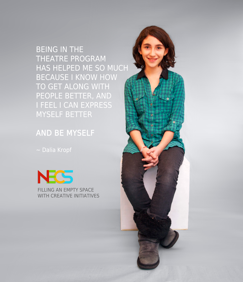
NECS Logo
This logo design for New Era Creative Space (NECS) was designed to communicate the company’s community-building mission: cultivating creative initiatives for children and adults.
At the onset, I wanted to apply a ‘clean’ approach to the logo, to project the vibe of a large organization without too corporate. I used four primary colors to convey harmony through diversity – diversity of ideas, demographics, creative programs, and possibilities. The colors promote vitality and energy, and lend themselves to all kinds of brand associations through color alone. The overlapped letters communicate “closeness” or “togetherness”.
Project Details
Client New Era Creative Space
Skills art direction, branding, graphic design, Illustrator, Photoshop
Links necspace.com
Here are some other things we did for this project.

